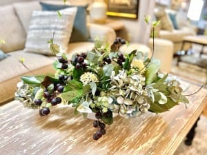
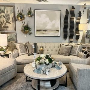
Interior paint selections for your home can sometimes feel overwhelming. Sherwin Williams paint stores in Cincinnati , Ohio has a great selection of soft and blending colors that help you with your interior design project. Don’t be afraid to introduce an accent wall of a deeper color. By creating the deeper painted wall it creates an illusion of width and destination for your eye to follow. Here are a few tips on your interior design selection of paint provided by Sherwin Williams design team. Sacksteder’s interiors provides color selections for your in home decor needs in the Tri Sate area surrounding Cincinnati, Ohio.
RED
- Ceilings: weighty and annoying.
- Walls: advancing and energetic.
- Floors: confident.
Red is predominantly used as an accent color, but we are currently seeing more of a trend using this color on walls. Large amounts of saturated red create a more complex space, while saturated brown-reds can make a room warm and inviting.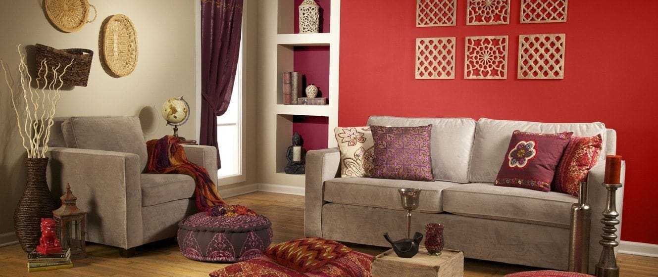
PINK
- Ceilings: soft hues delicate and comfortable.
- Walls: complementary to skin tones when soft or pale. Dramatic when highly saturated and vivid tones are used.
- Floors: for select and special spaces.
ORANGE
- Ceilings: energizing and advancing.
- Walls: soft peachy tones are warm and glowing. Bright tones are energetic, burnt orange shades are rich and warm.
- Floors: creates movement.
While orange is reserved typically for accents, pastel oranges are cheerful and lively. When this hue is close to peach, it has the ability to enhance skin tones and therefore would be a suitable color in a bathroom.
BROWN
- Ceiling: dark hues are heavy but work in high, open ceilings, especially to conceal exposed ductwork.
- Walls: mid-tone and dark hues can evoke richness, warmth and comfort. Soft hues are natural and create a neutral backdrop for furnishings.
- Floors: implies durability, stability and reliability.
The light values of brown are good environments for work or for living. The red-browns have a good use in interiors because they bring warmth and comfort.
YELLOW
- Ceiling: light hue, luminous, reflective and glowing.
- Walls: warm if a golden hue.
- Floors: bright hues are distracting and agitating.
Ideal for safety purposes due to the high visibility qualities, it also appears brighter than white.![]()
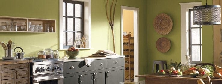
GREEN
- Ceiling: protective (reflection on skin tone can be unattractive).
- Walls: safe, calm, reliable, neutral, yellow based hues create warmth, blue based hues tend to be cool.
- Floors: natural up to a certain saturation point (light to dark), soft, relaxing (if closer to blue-green).
Green is an excellent color for interior environments, especially when involving concentration and meditation.
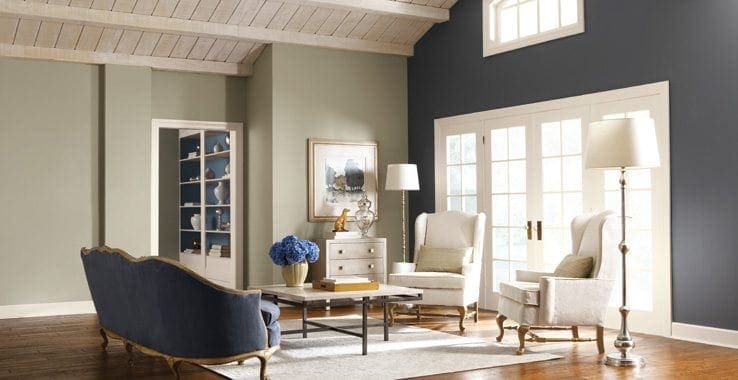
BLUE
- Ceiling: soft shades are cool and heavenly, dark hues give the illusion of the ceiling advancing.
- Walls: pale to mid-tone shades are soothing, darker hues provide a dramatic backdrop.
- Floors: movement (darker hues) to effortless movement (lighter hues).
Blue has a tendency to be cold and bleak if applied to large areas. Medium or deep tones are appropriate in incidental areas. Pale blue is refracted sharply by the lens of the eye, therefore it tends to cast a haze over details and objects .
 GRAY
GRAY
- Ceiling: shaded, creates shadows.
- Walls: bland to neutral, cool and neutral.
- Floors: neutral. Blends into a space.
Gray is the color, which inspires creative people to become more creative. Gray is a great classifier. It performs the opposite of orange in that it makes things seem more exclusive.
WHITE
- Ceiling: blank – creates lightness, reflects light and reduces shadows.
- Walls: neutral to empty, clean.
- Floors: intimidating.
White indicates delicacy, refinement and sophistication. White may be too harsh as an interior color in some climates. All-white work environments encourage great precision.
BLACK
- Ceiling: heavy but works well for an exposed ceiling with open ductwork.
- Walls: threatening or dramatic.
- Floors: unusual and absorbing. Dark furnishings would get lost placed directly on this floor color.
Black is very dependent on where it is used. Black works as an accent color in either residential or business interiors. It is associated with dignity and sophistication. Sacksteders home decor is the perfect accent on inspiration for your interior design projects for 2014. Accenting with wall art decor, silk floral,mirrors,clocks and custom window treatments will be the icing on the cake for your renovation home decor design project. Finishing touches that make a difference. Visit our new design showroom opening in February 2014 located at 9797 Montgomery Road Cincinnati, Ohio 45242. Our Indiana interior design showroom is open 7 days a week at New Trenton , Indiana off the Brookville lake exit. Stop by and see me!